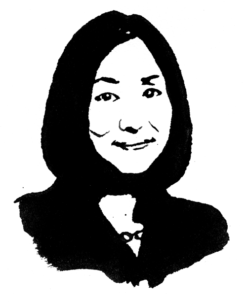
NORIKO KAWAKAMI, associate director
After majoring in social science and journalism, Noriko Kawakami was the editor of design magazine AXIS from 1986 to 1993. Since then she has been working as an independent design journalist and editor, contributing to numerous design magazines, newspapers and journals in Japan and abroad. Her published writings include Realising Design and le design. She was appointed Associate Director of 21_21 Design Sight in 2005.
What was the background story to the establishment of 21_21 Design Sight?
NKBack in the 1980s Issey Miyake felt strongly about establishing a design museum in Japan and was discussing the idea with some prominent figures, including artist Isamu Noguchi, graphics designer Ikko Tanaka and architect Tadao Ando.
At that time, the government was helping to build plenty of museums to house art collections, but there was no equivalent museum for design, since design is related to commercial activities. Companies and designers would work together, but the resulting work would never be archived; if a company cut off its relationship with a designer, that person’s work might not find an outlet and could end up being forgotten. Talk of creating a design museum would surface from time to time, but then disappear. The contemporary nature of design makes it difficult to archive: new works are constantly being produced, so any talk of establishing a design museum will face questions of what budget it will require and how broad the scope should be.
How did it come to be established in Roppongi?
NKIn 2003, Issey Miyake wrote an article for the Asahi Shinbun titled, “Time to Create a Design Museum.” The article got a great response and happened to coincide with the planning of the Tokyo Midtown complex. A specific site was being kept open for the building of a museum, but whether or not that would be a design museum was still up in the air. The first decision was to change our focus from accumulating an archive to creating a site for design-centered activities. It would be fantastic to have a design museum that could function as an archive, but considering the very expensive real estate in Roppongi, this would not be the ideal location.
If archiving is not its purpose, how does 21_21 Design Sight define itself?
NK21_21 Design Sight is neither a design museum nor a design gallery. Naoto Fukasawa, Taku Satoh, Issey Miyake and I wanted to create a place where many people could enjoy seeing, feeling, experiencing and learning about design. We deliberately eliminated the standard appointed museum positions and, as I said, there’s no archive. We hold not just exhibitions, but also other programs, including stage performances. So, 21_21 Design Sight is a remarkably flexible place: it’s a research center, an activity base — it’s quite easy to string some words together to give a general description, but it can’t easily be placed within any of the established definitions that people apply to other venues. In the end it’s a kind of ‘design facility.’
How are the personalities of the three directors reflected in the exhibitions?
NKThe three directors always discuss the facility’s overall direction together. They are all extremely busy but have held monthly meetings since the beginning of 2005 to talk amongst themselves about current and upcoming projects. They decide everything together: the lack of hierarchy works positively.
Each designer works in different genres: Miyake-san in fashion design, Fukasawa-san in product design, and Satoh-san in graphic design. The three of them put out their ideas and from there they discuss and reach their decisions together. One of the decisions they made was for each of them to organize an exhibition individually over the course of last year and this year. The three of them then each invited outside directors, and in collaboration with the directors and a lot of outside contributors, they proceeded to organize their respective exhibitions, periodically giving reports to the other two.
How do you go beyond the regular display of design works?
NKUsually design galleries or museums display a certain type of product, whether it’s chairs, bowls or stationery. The keywords we give our exhibitions are taken from everyday life but are deliberately abstract: for example this past year we had Chocolate and water; the next exhibition is XXIst Century Man1 and the one after that will be Nature.
For each exhibition, the director in charge interprets the keyword. For the Chocolate exhibition, Fukusawa-san drew on his experience of running workshops for young designers, so in addition to commissioning works from foreign designers, he incorporated workshops during which young designers could create new works. For the water exhibition, Satoh-san formed a team of core members that would discuss, conduct research, study together and take part in different elements of the creation process in the run-up to the exhibition. Each process was tailored to each exhibition.
Each of the three directors has had a long career and has firsthand knowledge of the conditions surrounding design today, and they use these exhibition settings to convey their own ideas. However, they’re not specialists in exhibition planning, so over the one-and-a-half to two years leading up to each show, they put in the time and effort to learn how to make it happen the way they want. This customized approach to each exhibition is completely different from conventional museums. In one sense 21_21 Design Sight is a giant workshop.
How much does the building design itself define exhibition planning?
NKThe building is also unlike a conventional museum. It’s not that it’s too difficult to use, but there’s a lot more to it than the typical white cube. You walk into a trapezoidal space from the entrance, and there are windows that let in natural light. Tadao Ando’s plan was structured around there being Gallery 1 and Gallery 2, totaling nearly six hundred square meters, but in practice we use all of the building’s spaces: the stairs, the space underneath the stairs, the area in front of the galleries and the narrow passageway at the back as well. Currently the space we use totals almost one thousand square meters. I’m not sure if this was Ando-san’s original intention, but from our perspective we are constantly inspired by the irregularity of the space, and we really enjoy the challenges of figuring out how to work with it.
How do you achieve the balance of easy-to-understand exhibitions for people who don’t know much about design and something suited to people working in the design industry?
NKFirst of all, I think our location helps a lot: Tokyo Midtown is the ideal place for us as it attracts a diverse crowd of people, including regular shoppers and design aficionados. We put up the Chocolate exhibition posters during the Golden Week holidays last year. Some passersby had no idea who Naoto Fukasawa is or what kind of work might be on display inside, so they would stand around debating whether or not to enter the exhibition. But when they did, it turned out that they enjoyed the exhibition the most and would be exchanging opinions among themselves the most. I feel that this kind of chance encounter with design is extremely important. The fact that we are located at ground level in a park makes it easy for people to walk in casually.
Our exhibition content is accessible to a broad range of people since the three directors and I take our clues from our daily surroundings. Even if it’s achieved through complete coincidence, I believe that our greatest success is if we manage to trigger someone’s interest in design, encourage them to think about what it is and what it means to our lives, and maybe even inspire them to start creating themselves.
I’m not sure whether design professionals had certain expectations of what 21_21 Design Sight would be, but I doubt they expected a facility that would choose not to focus on displaying product design. The Chocolate exhibition wasn’t about displaying chocolate-making utensils or actual chocolate; rather Fukasawasan wanted to express something that was at once personal and yet could be shared, through the memories and experiences of chocolate that the participating artists had. Whether it is industrial, graphic or fashion design, the essence of design exists in this element of sharing.
What do you think about the redevelopment of Roppongi?
NKI think the area has become very interesting as a result. Roppongi has always attracted creators. Mitsui Fudosan Real Estate even used ‘design’ and ‘culture’ as its keywords in redeveloping this area. The fact that design has become one of the main considerations for developers signals a new era and new possibilities.
Do you think that the founding of a design facility like this suggests that design has come to be considered a form of fine art?
NKThis is a very difficult question to give a simple answer to. 21_21 Design Sight is fundamentally meant as a place where people can tap into a sense of ‘human creativity’ and consider how it applies to our future. There’s the word ‘design’ in the name, but we want artists to participate in our activities too. We’ve tried to stay away from the usual distinctions between art and design, since our focus is on ‘human creation.’
Although we have not decided all of our future plans, the three major exhibitions we’ve had so far have not been about showing mass-produced products but about showing original pieces that convey the ideas each creator had in response to the exhibition theme. They may be artistic, but they convey a message that lies at the heart of design.
When does a design piece transcend regular client work and become worthy of display in an exhibition?
NKIn design, there is a process wherein the creator, whether it is a designer or manufacturer, seriously contemplates how to produce something that someone else will use. That process takes time: designers draw sketches, manufacturers make models and in the case of high-tech items, engineers become involved and argue with the designers. So many people are involved in thinking about how each product will be used in our lives, and these decisions shape our future.
This process leads to something beyond the present. As I just said, this process takes a certain amount of time, but some products on the market have been rushed. In terms of our own display criteria, products that have been produced over a sufficient period of time and that clearly lead to something in the future would make it to 21_21 Design Sight because they have a clear message.
Why do you think designers tend to establish themselves more successfully than artists?
NKI suppose you could say that the mass production aspect of design makes it easier for designers to establish themselves. I don’t know whether you would call this success or not, but one interesting difference is that someone could be using a designer’s product even if they don’t know the designer’s name.
Whether it’s art or design, people can fall in love with a piece regardless of whether they know who made it. Where product design differs is that a product circulating in society can freely have an impact of its own without the designer or a museum being involved. Many designers care more about their creation being used in someone’s home than being on display in a museum.
What do you think of the crossover potential between art and design?
NKArt and design are overlapping more and more. For example, furniture is usually mass produced, but art galleries now produce limited-edition pieces, some of which may be made of rare materials that are too expensive to be mass produced. In effect these are a form of artwork. Art galleries and design galleries that do this are providing increasing opportunities for designers to realize experimental designs, and in turn they can use the feedback they receive from these experimental, limited-edition design pieces to enhance their designs for mass production. Pieces like these are then shown at design fairs and attract the attention of art collectors from the art world. For these collectors, a chair with a limited number of editions could become the centerpiece of conversation, as well as a usable art piece.
From another perspective, designers are now having to look within themselves, at their lives, and think about their purpose, in a process that is similar to the artistic creative process. Mass production in the 20th century was partly driven by the desire for a better material life, whereas now our lives are full of designed products, so the meaning and purpose of design needs to be reconsidered. We are currently in a transitional period, so I’m extremely curious to see what will happen next in art and design.
What changes have there been in Japanese design over the past fifteen years?
NKThe period before the bubble burst was one of experimentation, but the economic crash forced us to reevaluate design at a level more firmly rooted in our everyday surroundings. Naoto Fukusawa often mentions the words ‘super normal’ to describe the work he believes in, which is a complete contrast to designers of the previous era who where caught up in creating the extraordinary.
The last fifteen years has seen work by Japanese designers becoming available online or at international design shows. There are aspects of Japanese design that Japanese people had not identified as being Japanese until they were pointed out by a foreign audience. This recognition has given Japanese creators the confidence to identify and express Japanese design culture, and to transmit meaningful design from Japan, but not in a superficial or gimmicky way.
The previous generation of industrial designers currently in their sixties and seventies received a Eurocentric design education and cultural influences from Europe. Now young designers in Japan are finding their own way forward. There are local craft centers all over Japan, working specifically with materials like iron or bamboo and young Japanese designers have begun to take interest in how they can use the work of these regional manufacturing specialists. They are taking a serious look at the design that existed in Japan long before they were born.
Noted
- The Chocolate exhibition was held from April 27 to July 29, 2007; water was held from October 5, 2007 to January 14, 2008; XXIst Century Man was held March 30 to July 6, 2008.↩

