Under the Influence:
The Syntax of Tokyo Graffiti
by Ian Lynam
Barry McGee is big in Japan—so big, actually, that the Watari Museum of Contemporary Art can’t contain him. As I approach the museum to see an exhibit of McGee’s work in this blustery September of 2007,1 I notice that this formerly graffiti-free neighborhood in Tokyo’s Gaienmae district is alive with stickers and tags. They adorn parking barriers, drink machines, street signs. As I approach the intersection that is home to Watari-um, I realize that McGee’s show is not only inside the museum, it has leaked out onto the neighboring buildings. Most noticeable and immediate is the name ‘Josh’ painted in ten-foot high classic graffiti letters outlined in red with a yellow fill. One of McGee’s stylized downand-out street people is spray-painted on the building across from the museum as well. McGee, the renowned Bay Area graffiti artist, has made his mark in a bold way in this Tokyo neighborhood, and the local graffiti writers are following suit.
McGee has influenced the style of many of Tokyo’s graffiti writers. A technically proficient painter with a pop sensibility, McGee has created a defined and aesthetically congruous kit-of-parts for his work. The art McGee makes is so stylistically strong and so signature that the parts are easy to identify as his. A number of artists, particularly graffiti artists, have picked up aspects of his work and run with them, especially in Tokyo.
The letters J-O-S-H boom out over the street on this fall day, commanding passersby to look at the name of McGee’s artistic collaborator Josh Lazcano.2 Every show I have seen of McGee’s work includes these types of nods to his friends, both in name and in deed—friends’ tags adorning the walls alongside McGee’s own. Some of McGee’s recent explorations in loose geometric patterns hang inside the storefront windows, collaged with zine layouts, flyers and color xeroxes of street snapshots of bicycles. One of McGee’s recent controversial images caricaturing American perceptions of Asian identity through a Mr. Magoo-esque3 series of ‘chinky’ cartoons is in there as well.
The decorated storefront is a good overview of McGee’s recent career—a diverse mix of influences from assorted aspects of American DIY culture: punk rock/hardcore, the San Francisco bike messenger/fixed-gear world, vernacular sign painting and graffiti. McGee stands front and center as an ambassador of a certain flavor of Bay Area culture to Japan, having exhibited repeatedly in Tokyo and continually bringing pieces of these assorted subcultures into his exhibitions. McGee has the street cred as well. Under his graffiti name, Twist, he has kept up a decades-long career as one of the most accomplished and respected graffiti writers on the streets, painting and tagging freight trains, mailboxes, walls and automobiles.
McGee’s influence, both as a graffiti writer and a fine artist, could be felt nowhere stronger than in the 2005 exhibition X-Color,4 Japan’s largest gallery exhibition of graffiti as fine art to date. It took a few decades for domestic graffiti stylings to really make it as a full-blown gallery reality in Japan. Small enthusiast shows of graffiti art have been commonplace over the years, with a growing street presence of graffiti by both international and homegrown writers.
The thirty-seven-artist-strong X-Color exhibition was unprecedented due to both the massive scale of the show, filling one of Japan’s larger art museums from floor to ceiling, and because it was solely comprised of Japanese writers. Despite the exhibition being indigenous, foreign influences were prevalent in the majority of the work. McGee’s stripped-down modern palette of black, white and red popped up time and time again within X-Color. Early in his larger gallery career, McGee made a habit of exposing the tools and ephemera of graffiti as installation, most notably in his first exhibition at Deitch Projects in New York in 1999. This trope was used here, as well: a room was assembled with an arsenal very similar to McGee’s stockpile of inks, markers and spray cans surrounded by found objects, vernacular signage and snapshots tacked to the walls. One of Japan’s more recognizable graffiti artists, Esow,5 has made a career out of emulating Twist’s work, painting very similar characters to the ones McGee became initially famous for on exterior walls and inside boutiques in Tokyo. McGee’s work was only one of myriad contemporary influences notable in the show, but it was strikingly noticeable.
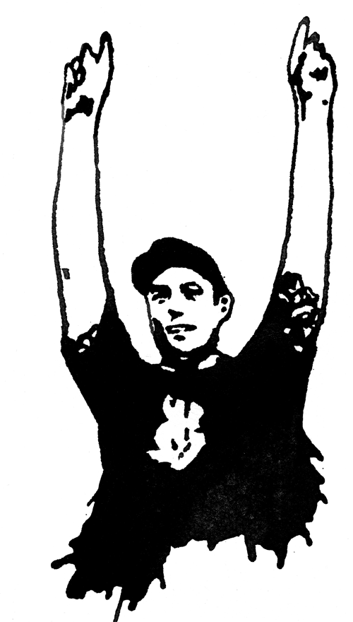
My favorite aspect of McGee’s work is the one increasingly downplayed in his gallery work: his tags.6 They are perhaps the most masterful, yet most overlooked part of his oeuvre: part calligraphic sign painter and part LA-influenced classic graffiti. It has been interesting seeing his tag out on the streets and seeing how it has changed since I lived in the Bay Area in the early ’90s. These days it has become a bit more angular, a bit more influenced by his younger peers’ lettering, turning from soft sign-painterly lettering highly influenced by Los Angeles graffiti writer Tempt7 to something a bit harder-edged. Bits of ornament (asterisks, angled dots on his ‘i’s and curlique swash underlines), linked ligatures and the calligraphic bar on top of the ‘T’ anchor my love for McGee’s tag.
In particular, I see echoes of the work of the MSK (Mad Society Kings) graffiti crew8 in Twist’s handstyle these days. MSK writers broke new ground in the assault on public space in the US—they coated freeway overpasses stories high, scaled buildings and painted the sides of ocean liners while slowly expanding membership from their hometown of LA to other cities across the US before hopping oceans to recruit crew members in Germany and Japan.
MSK members’ graffiti sets the visual stage in Tokyo, as they are among the most prolific vandals, their stickers, tags and paintings outshining their graffiti peers in both quantity and placement. The Tokyo branch has definitely taken the crew ethos seriously, as they spend a lot of time putting their names up with the obligatory MSK shoutout all over town via paint, marker, sticker and other methods.
Graffiti writer Wanto9 has giant geometric block letter pieces painted in nearly every ward in Tokyo. Using flat exterior housepaint, he rolls out giant geometric grotesk10 capitals; he uses spraypaint to outline the letters and add a drop shadow. Popping up along most major train lines and on top of buildings seen from the highway driving in and out of Tokyo, these pieces have both a scale and frequency that is staggering.
Route 246, the artery funneling people through Tokyo, has a several-mile stretch where Wanto has tagged every few feet sloppily and rapidly with a shoe-polish dauber filled with indelible ink. There is also the occasional pitstop to paint one of a variety of styles of throw-up:11 straight, textbook block capitals; highschool-notebook bubble letters; or a cartoonish pointy-topped bubble-letter variant. Outlines loop and connect, the obvious product of a practiced hand working quickly from a mental blueprint.
The same can be said of writer Sect’s12 treatment of huge portions of Sangenjaya and Futako-Tamagawa, back-to-back stacked throw-ups lining the Den-en-Toshi line train tracks. The hastily spray-painted strokes loop from side to side, the overspray doing half of the work from the can being held back half a foot from the wall and finished off with a few quick outline strokes.
Benet’s13 business-card-sized BNE参上 (BNE has arrived) stickers are an omnipresent aspect of the Tokyo streetscape. Composed of screenprinted vinyl backed with an industrial adhesive, they do not come off easily like the works of other writers who use peeledback paper ‘Hello, My Name Is’ stickers and United States Postal Service Priority Mail address labels. Tokyo retailers have taken to scraping the stickers off with a razor as chemical compounds don’t seem to work very effectively.
Ekys’14 mixed upper and lowercase tag adorns vending machines and outdoor air conditioners across the city. Using sloped, leaning-back straight Roman letter forms in ink and spraypaint, Ekys is potentially the most visible writer in Tokyo. From the windows of the Yamanote Line that rings Tokyo, his name pops up regularly in silver-filled and black outlined block letters, occasionally spelling out passing variations on his moniker such as EEEEKYSSSSSSSS, like animation cels for train-riding citizens.
These writers focus on tagging and throw-ups — the less ‘painterly’ aspects of graffiti. They lean more toward vandalism than art as objects of beauty, per se. Their work offers up a potentially different variant of graffiti: it is a form of communication that has yet to be recognized: one of syntax. Through spatial repetition and placement, these writers deploy written language of the most minimal sort across Tokyo. There is a focus on what is being said, but just like other forms of language, speech and writing, how and where the statement is conveyed carries just as much meaning.
Tokyo’s graffiti writers are tactically inserting this form of feral communication into the city’s public sphere, forcing the public to interact with their names. Long workdays and extensive commutes leave the city’s denizens with minimal time for inhabiting private space, making them more or less a captive audience to the spectacle of the Tokyo streetscape and how writers decorate it. Where writers choose to paint their names takes on meaning, repetition forcing cognizance, and particularly risky placement pushes the work’s social relevance.
Perhaps the most interesting of the errant decorators is QP.15 His oddball hybrid letter-form characters break from the highly readable norms of his compatriots. Preferring a monochromatic palette, his tags are the most difficult to read. QP has a unique approach to dissecting physical space with these ragged tags and clean-lined throw-ups. His placement is far less formulaic, and infinitely more idiosyncratic than his friends’. However, there is a commonality between QP and the other MSK writers: they define themselves and their practices by being up. It’s about having as many pieces on the street as possible, not about creating something subjectively ‘beautiful.’
Off of the street and in galleries, QP tends toward symbolismheavy work. For the X-Color show, he created an exploded hut rendered in corrugated sheet metal and discarded home electronics painted in black and white. With multiple generations living under one roof, home in Japan is most often a place to sleep, but not to relax for younger people. Shared space takes up that role during leisure time: manga kissa cafés, karaoke boxes, love hotels — spaces for hire where the individual can let down his or her guard. Tokyo has a deconstructed and different sense of space—discrete, but not truly private, privatized but somehow confused in our greed for things of our own. QP’s installation—his mustachioed Qs painted from wall to floor to shipping container—hinted at this fractured sense of public and private. Microwaves spilled tags, while others had exteriors painted out, potentially protecting us from something dangerous inside.
I view these writers’ work on the street as art’s potential third sex: about neither concept nor beauty—instead relying on application, context and frequency to communicate their desire. Within the gallery, however, the Japanese writers-as-artists need to push further in some unknown direction to be seen as something other than formal stylistic emulation.
Noted
- Held from June 2 to September 30, 2007.↩
- Josh Lazcano is a resident of San Francisco, fine artist and frequent collaborator with McGee. He has had numerous international shows.↩
- Quincy Magoo is a squinty-eyed, farsighted, elderly cartoon gentleman who infallibly found himself embroiled in wacky situations in animations from the 1940s through the 1970s.↩
- X-Color – Graffiti in Japan was held from October 10 to December 4, 2005 at the Art Tower Mito in Ibaraki Prefecture.↩
- Esow is a graffiti artist based in Tokyo.↩
- Tags are calligraphic graffiti signatures. They are the simplest form of graffiti.↩
- Tempt One is a graffiti writer from Los Angeles. He is one of the founders of Big Time, one of Los Angeles’ premiere graffiti magazines. He was diagnosed with Lou Gehrig’s Disease (ALS) in 2003. He is considered to have one of the most influential tagging styles in California.↩
- Graffiti crews are groups of writers who share a team name, often an acronym.↩
- Wanto is a Tokyo-based graffiti writer affiliated with the MSK graffiti crew.↩
- Grotesks are simplified sans serif letterforms.↩
- Throw-ups are sizeable pieces of graffiti that consist of one color for the fill and another color for the outline. They are commonly comprised of bubble letters.↩
- Sect is a graffiti writer affiliated with the MSK graffiti crew. He is based in Tokyo.↩
- Benet is a graffiti writer affiliated with the MSK graffiti crew.↩
- Ekys is a Tokyo-based graffiti writer affiliated with the MSK graffiti crew.↩
- QP (Querencia Peligrosa) is a Tokyo-based graffiti writer affiliated with the MSK graffiti crew.↩
About the Author
After cutting his teeth writing music reviews for weeklies in New York and a decade-plus span editing and self-publishing zines in California and Oregon, Ian Lynam jumped ship to Tokyo in 2005 and opened a multidisciplinary design studio. Previously, he logged time as a designer and art director for some of the top design firms and advertising agencies in the US.
He is the author of Parallel Strokes (2008), an analysis of graffiti and typography. He is also the design editor and art director of the Japan-focused cultural journal Néojaponisme. You can see more of his work on ianlynam.com.